- A Note from Our President
- Restricted content
- Finnish Edition of the Amsterdam Magic Show
- Blackpool 2023
- How a Musician Would Learn a Magic Trick
- The Bill Chung Lecture, Review
- Agenda, April 2023
- Simplicity, the keynote to good magic
- The AMSociety Seal
- Georgia Wonder Used Physics to Make Magic
- Hello, Mr. Stone
Behold!
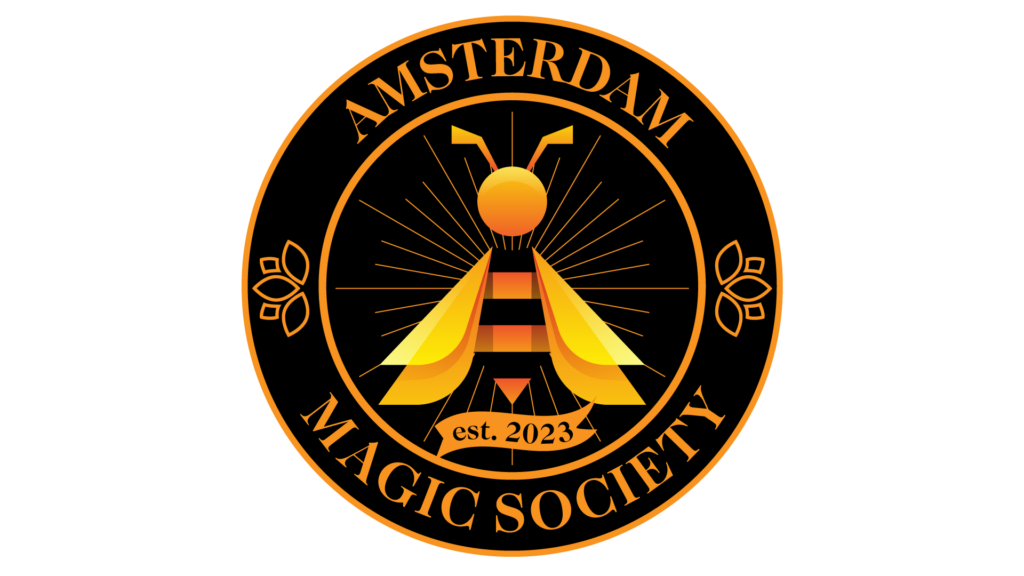
Here is the newly minted Amsterdam Magic Society seal. I offered to develop a temporary logo; however, I believe what emerged may be the seal for some time. Sometimes, as a graphic designer, many ideas come together quite quickly and in such an explosive way – the synergy is undeniable. Frans asked me to explain some of the visible & hidden elements in the design in this, the first issue of The Buzz. Before continuing, I invite you to look at the seal and discover your interpretations. Like the Tarot cards, the seal could mean many things – at least as many as those that will see it & more. I would love to hear what you see in the seal.
The main feature is a hornet hovering mid-flight. The hornet represents the members of the Amsterdam Magic Society and our tendency to fly far away cities, do our magic, and then return to our nest in Amsterdam. The twin sets of wings represent the twin arts of Magic & Mentalism. The hornet’s alternating yellow and black stripes represent the portions of our acts that the audience sees and the parts we hide. You may also see a performer with his cape unfurled behind him & radiating lines representing light & power.
He is flying over a compass – indeed, the whole seal is a ship’s compass complete with East and West marked and the S in Society marking South. The points in the background mark out a few other significant letters in the Society’s name. These letters spell either Mage or Magi (the plural of Mage) as we perform alone and together.
The banner with the year 2023, the year of our first formal meeting, is in the shape of the asymmetrical hand gesture associated with the ‘ta-da’ pose. This gesture has been part of human non-verbal communication long before the first stage performer. I recommend studying its effect on the observer if you haven’t yet had the chance to do so. The banner goes from down to up, as it signifies both the build to the performer’s act and the undoubtedly upward path of the Society from 2023 to the future.
Our Society’s name is written in a typeface you may not know the name of but may resonate with you. People have seen these letters since just after Shakespeare’s time. William Caslon created this typeface in the early eighteenth century. From London, Caslon based it on the dutch baroque typefaces popular at the time. Used initially for metal printing, Caslon represents our acts imprinting themselves into the minds of our spectators. Visible in the A, M & Y letters are contrasting weights – very thick and very thin. In the century that followed, this feature was exaggerated in the typeface Bodoni – versions of which are still used by the most high- end stores and magazines like Burberry & Vogue. There is one last thing. The seal is orange—the color of fire & activity – and, of course, the color of The Netherlands. Now you can see into my dreams. What are yours?
Evan Kastor